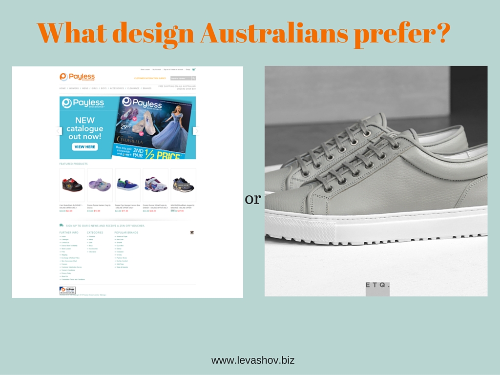
Designing for who?
Do you know what is the difference between great and not so great web designer? Apart from other factors such as technical and creative skills, speed of work and others, great designers design for the target audience. They can set apart their own perception of what is nice and look via the website target audience eyes. In very simple example, if you personally dislike green, but know that this is the colour that target audience for some reason found appealing, you use green in design.
Saying that will be fair to admit that very often designers don’t really know what are preferences and tastes of their target audiences: not so many businesses can afford conduct researches to find it out. That is why I was very interested when noticed a link to the quite fresh research in this area: in absence of specific data it is good to have at least general one.
In 2014 Katharina Reinecke (University of Michigan) and Krzysztof Z. Gajos (Harvard University) published their paper called “Quantifying Visual Preferences Around the World”. In their work the researchers tried to find what people from different demographic consider ‘good design’. The study was quite extensive and based on around 40,000 of participants and 2.4 millions of evaluations. In particular they studied preferences of people toward design colourfulness and visual complexity.
So what design Australians prefer according the results of the research?
Below is the chart from the research that illustrates how Australians are positioned on preferences to complexity and colourfulness among other countries
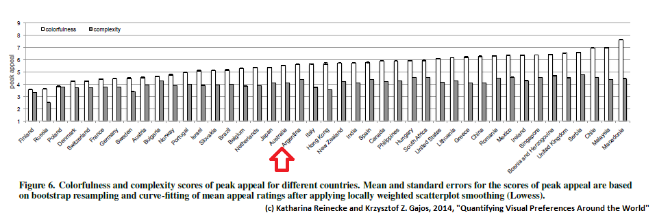
It means, that Australians in general prefer website designs with:
- Medium complexity
- Medium colourfulness
Also, in average Australians are not affected by colour saturation.
Other interesting results from the research
- Women prefers more colourful websites than men
- People under 20 and over 50 prefer more colourful websites than those in 21-49 age bracket
- Older people prefer more complex websites than younger
- Female more than male dislike very simple websites
- Women prefer websites with more subtle colours transition without stark contrasts that men like
References
- Original research “Quantifying Visual Preferences Around the World” – http://www.eecs.harvard.edu/~kgajos/papers/2014/reinecke14visual.pdf
- Visual preferences test used in research (you can try to take it and see your preferences) – http://www.labinthewild.org/studies/aesthetics/