Checkout is considered as one of the most important steps of online buyer customer journey. Here you can easily kill your conversion and turn enthusiastic prospect into angry detractor. According statistic from Wordpay (data collected from 19,000 consumers and 153 industry experts in 2012) problems with checkout process are among the most important reason of shopping cart abandonment. Taking into account that industry average for cart abandonment is over 60%, right checkout process is very important factor for good conversion and hence healthy revenue, profit, customer satisfaction, lifetime value and bunch of other metrics critical for ecommerce business success.
Multi-step, accordion and one page checkout
From UX/design point of view approaches to checkout on ecommerce website can be classified into three categories.
Multi-step checkout – a traditional way to organize checkout process with distinct steps split across several pages/screens
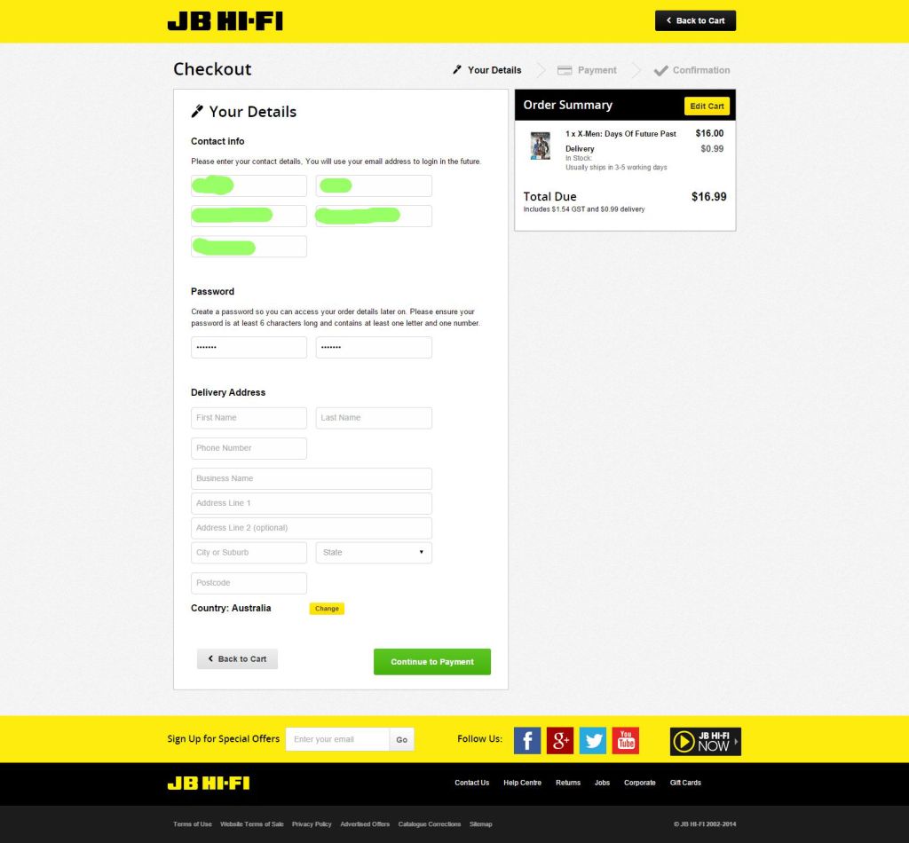
One page checkout – when all the information required for checkout is condensed in one, typically quite long form
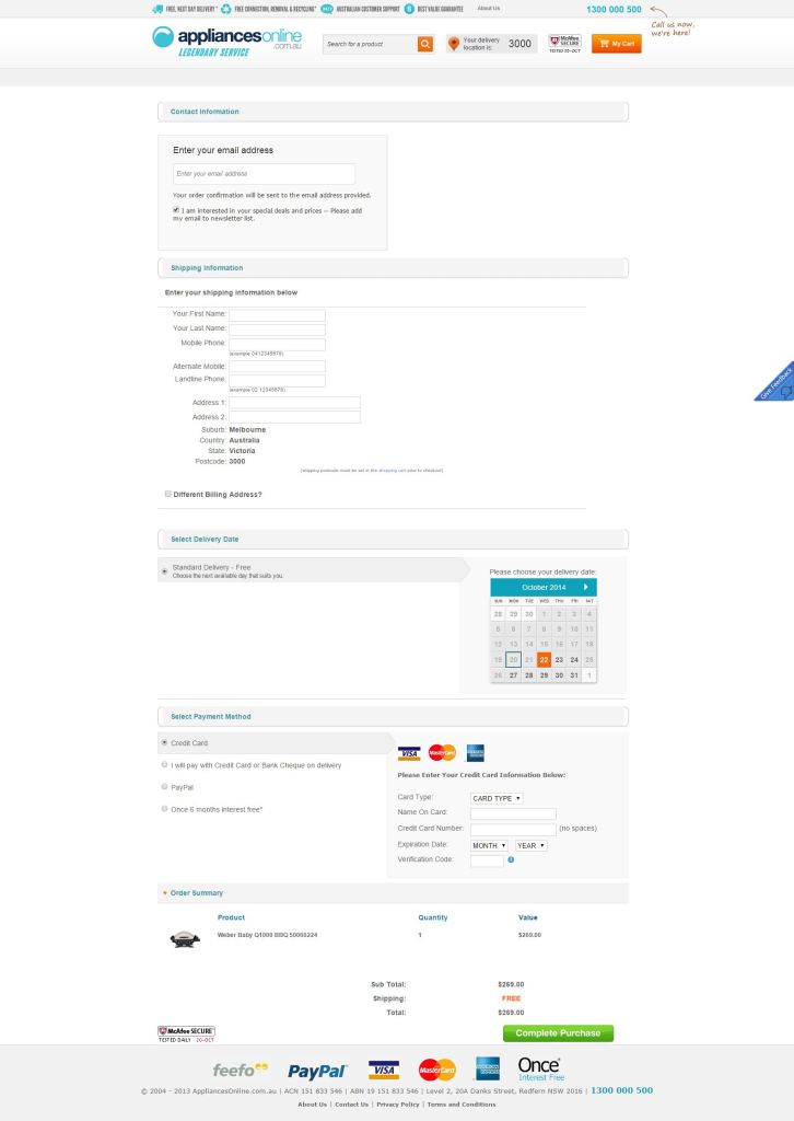
Accordion – a compromise way: the information is presented on one page, but only one part (e.g. billing address) is visible in a given time
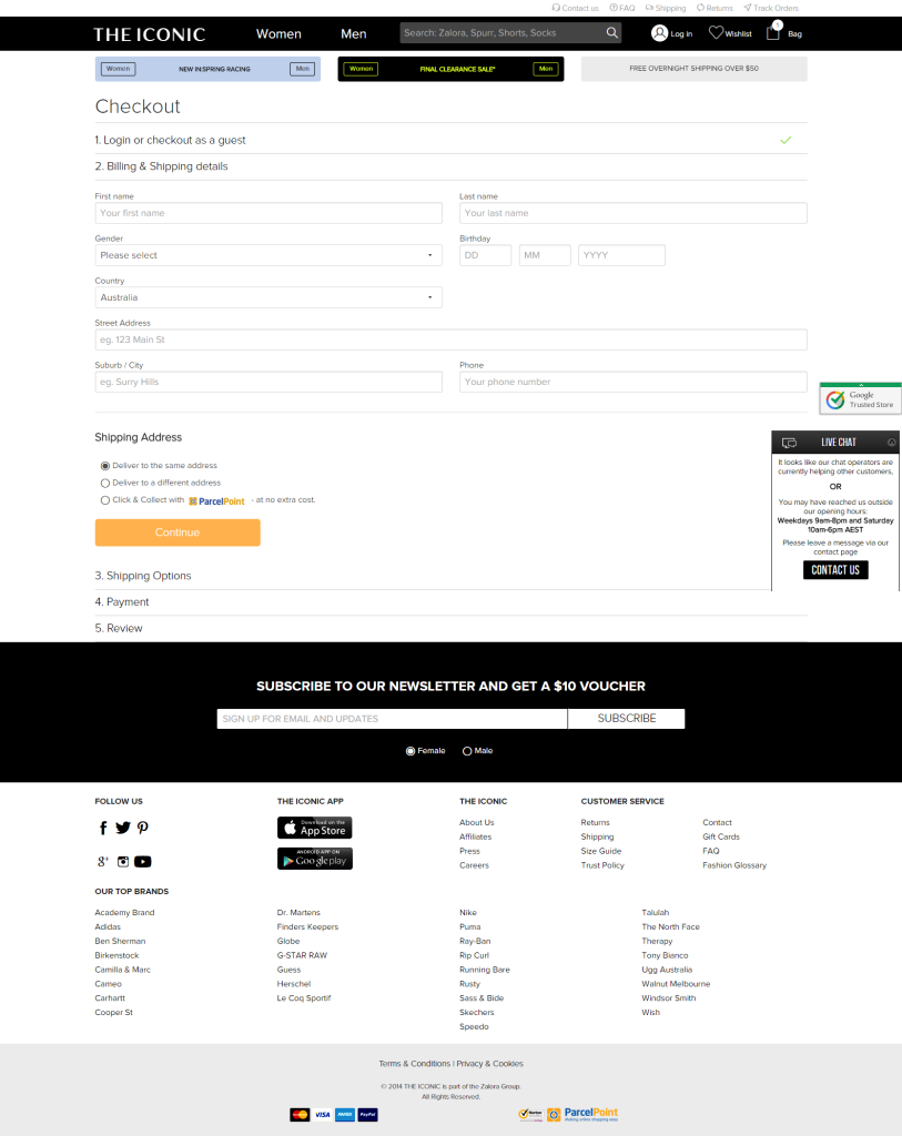
What and when works better is an issue of constant discussions in ecommerce and UX communities. Demac Media did a great job to describe all three ways, you will find the link to their post in the references section. Briefly one page checkout is recommended for more tech savvy customers, frequent buyers and with the purchases that have lower involvement. Multi-step approach works better for older, less technically literate customers and where the involvement ratio is high. An accordion is a compromise solution that tries to accommodate the benefits of both approaches.
What’s going on with checkout design in Australia
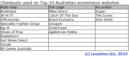
Taking into account all that debates about different checkout mechanisms, I decided to find out, what methods are employed by the top Australian retailers. For the reference I’ve used the same list of top 20 Australian retailers from Smartcompany that I used when checked ecommerce platforms. I had to exclude one of the retailers from the study as not very relevant – Westfield doesn’t really sell products on their website, they rather sent customers to purchase it from participating retailers. For Specialty Fashion Group that has multiple brands I examined Miller.com.au website, so the sample size was 19 website. The chart below illustrates what I’ve found.
As you may see over the half of retailers prefer multi-step design, 1-page checkout is employed by 31.6% of reviewed websites and accordion checkout is lagging, it is used by only 3 top merchants (15.8%). Full results are in the table below:
The conclusion
So what will be the best way to organize checkout at your online store? The quick answer – it depends, there is no silver bullet. Think about your customers, your products, the context – environment when the purchase is typically done (it maybe quote surprising as I have found when researched how Melbourne CBD can generate so much online sales). Conduct usability testing before going live and A/B or multivariate testing along the way and you’ll find the design of the checkout that works best for you.
References
- Demac Media about different checkouts – http://www.demacmedia.com/design-user-experience/checkout-debate-multi-step-one-step-or-accordion/
- Shopify article “Why Online Retailers Are Losing 67.45% of Sales and What to Do About It” with statistic about why customers abandon shopping carts http://www.shopify.com.au/blog/8484093-why-online-retailers-are-losing-67-45-of-sales-and-what-to-do-about-it
- Smartcompant article “The top 20 Australian online retailers of 2013” http://www.smartcompany.com.au/growth/economy/30934-the-top-20-australian-online-retailers-of-2013.html
One thought on “One page, accordion, multi-step: what checkout designs are used by top Australian online stores?”